CSSで写真をオシャレに丸く加工するTipsとしてコードを書いてみた

スポンサーリンク
最近よく見かける丸い写真のデザイン。特にプロフィール写真とかで多用されていますね。
フラットデザインの潮流で、僕もスマホのハイブリッドアプリのデザインとかでも利用することが多くなりました。
丸くするのはCSSのborder-radiusで超簡単に実装できるのですが、ちょっとアレンジするだけでオシャレになりますのでサンプルソースを書いてみました。
目次
写真を丸くする
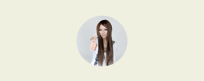
まずは普通に丸くしてみます。
border-radiusを50%で指定すれば、面倒なピクセル数計算をしなくとも、正方形の画像であれば円形になります。
imgに対して角丸を適用することも可能ですが、その場合は縦横比は1:1の正方形を使いましょう。
長方形の画像だったら、divの背景画像として扱う方がやりやすいとは思います。
コードをすっきりさせたかったのでdivのボックスに対するbackground-imageで実装しています。
HTML
<div class="circle-thumb"></div>
CSS
.circle-thumb{
	width: 100px;
	height: 100px;
	background-image: url(../img/thumbnail.jpg);/*丸くしたい写真*/
	background-size: cover;
	background-position: center center;
	border-radius: 50%;/*角丸*/
}
写真を丸くして影をつける
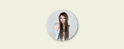
写真にドロップシャドウで影をつけました。
HTML
<div class="circle-thumb-shadow"></div>
CSS
.circle-thumb-shadow{
	width: 100px;
	height: 100px;
	background-image: url(../img/thumbnail.jpg);/*丸くしたい写真*/
	background-size: cover;
	background-position: center center;
	border-radius: 50%;/*角丸*/
	box-shadow: 1px 1px 6px rgba(0,0,0,0.6); /*ドロップシャドウ*/
}
写真を丸くして内側に影をつける
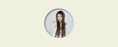
写真の内側へ影をつけて、写真部分がくぼんでいる感じにしてみました。
box-shadowをそのまま対象の写真へかけても、insetの場合は効きません。
そこで、もう一階層、透明のブロック要素を重ねるのがミソです。
HTML
<div class="circle-thumb-inset-shadow"></div>
CSS
.circle-thumb-inset-shadow{
	width: 100px;
	height: 100px;
	background-image: url(../img/thumbnail.jpg);/*丸くしたい写真*/
	background-size: cover;
	background-position: center center;
	border-radius: 50%;/*角丸*/
	position: relative;
}
.circle-thumb-inset-shadow:after{
	content:" ";
	width: 100px;
	height: 100px;
	border-radius: 50%;/*角丸*/
	box-shadow: inset 1px 1px 6px rgba(0,0,0,0.6);/*内側へのシャドウ*/
	z-index: 2;
	position:absolute;
	top: 0;
	left: 0;
}
写真を丸くして吹き出し風の形にする
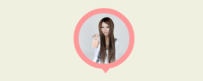
写真の周りにボーダーを使って、バルーンの吹き出しを作ってみました。
HTML
<div class="circle-thumb-border"></div>
CSS
.circle-thumb-border{
width: 100px;
height: 100px;
background-image: url(../img/thumbnail.jpg);/*丸くしたい写真*/
background-size: cover;
background-position: center center;
border-radius: 50%;/*角丸*/
border: 10px solid #FF9999;/*ふちどり線*/
position: relative;
}
/*以下borderで三角形をつくります*/
.circle-thumb-border:after{
content: ' ';
height: 0;
width: 0;
position: absolute;
left: 45px;
top: 109px;
border-top-width: 10px;
border-right-width: 8px;
border-left-width: 8px;
border-top-style: solid;
border-right-style: solid;
border-left-style: solid;
border-top-color: #FF9999;
border-right-color: transparent;
border-left-color: transparent;
z-index:  2;
}
こんな感じで、ただ丸くするよりも、ちょっとひと手間かけてみると面白くなると思います。お試しあれ。
スポンサーリンク